Understanding how color theory and white balance work in photography can make a big difference in the quality and impact of your images. When I first started out, my photos sometimes looked too yellow, blue, or dull, and I wasn’t sure why. Later, I learned that having a handle on color theory and knowing how to set white balance could solve many of these issues. In this article, I’ll walk through what you need to know about color and white balance, and give you practical tips for putting these concepts into practice.
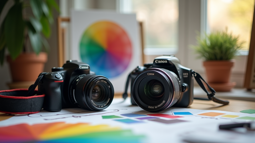
Why Color Theory Matters in Photography
Color plays a big role in the way people see and feel about a photograph. Colors can spark emotions, highlight your subject, or tie different elements together. When I started exploring color, I found that even small tweaks made big changes to the moods of my photos. The more I paid attention to how colors worked together, the more intentional and effective my photography became.
A basic understanding of color theory makes it easier to avoid awkward color combinations and helps you use color to send the right message with your photos. For example, using complementary colors, like blue and orange, creates contrast and draws the eye. Using analogous colors, which are shades next to each other on the color wheel like green and blue, gives your images a more harmonious and calming feel. Over time, you’ll notice how people respond differently to specific palettes and learn to trust your color instincts.
What is White Balance and Why is it Important?
White balance is the process of making sure that the colors in your photo look natural. Cameras see light differently than our eyes do, so sometimes photos will have a strange color cast, looking too blue, orange, or green depending on the lighting situation.
The right white balance helps keep whites looking truly white and makes other colors appear accurate. When I shoot indoors with standard lighting, photos often look a bit yellow or orange if I leave the camera on its automatic settings. Adjusting the white balance can neutralize that color cast, making skin tones look healthy and reducing the need for lots of post-processing work later. Learning to pay attention to white balance helped me consistently get colors I wanted without hours spent on editing.
Getting Familiar with Key Color Theory Concepts
Before you dig into the techniques, it’s helpful to get familiar with a few important terms and ideas:
- Color Wheel: This shows the relationships between colors. Primary colors (red, blue, yellow), secondary colors (green, orange, purple), and tertiary colors all have unique roles in creating color harmony.
- Complementary Colors: Colors directly opposite each other on the color wheel, like red and green, provide strong contrast in your photos.
- Analogous Colors: These are colors that sit side by side on the wheel, like yellow and green. They create a gentle, natural feeling.
- Saturation: This controls how intense a color appears. Saturated colors are vivid and bold, while low saturation looks more muted or pastel.
- Hue: This is simply the name of the color (such as blue or orange).
The more I practiced using these concepts, the more control I felt over my images’ personalities. I realized that shifting toward vivid, saturated colors made images pop with energy, whereas soft pastels evoked serenity and nostalgia. Just by adjusting these aspects of color, you can create a certain mood or feeling that draws viewers into your photograph every time.
White Balance: Practical Settings and When to Use Them
Most digital cameras give you several white balance options. Here’s a quick guide to the most common settings and what lighting situations they’re made for:
- Auto (AWB): The camera tries to guess the right setting based on the light. I start here when I’m in changing light or unsure of what to pick.
- Daylight: Best for shooting in bright sunshine. Photos will look natural, and you won’t get a distracting blue or yellow cast.
- Cloudy: Adds a bit of warmth to counteract the coolness of an overcast sky. My images come out looking less flat, more inviting, and closer to how I remember the scene.
- Tungsten: Used for typical indoor lighting, which can make photos appear orange. This setting cools down the image, producing more neutral colors.
- Fluorescent: Balances out the greenish tint from many office or school lights so your photos look more natural.
- Custom/Manual: This is a favorite for tricky lighting. I use a white object, like a piece of paper, to tell the camera what true white should look like in the current light. Custom settings give you the best results during challenging shoots or mixed lighting scenarios.
Experimenting with these settings in different locations helped me see which ones worked best, and eventually I could predict what each one would do even before pressing the shutter. Having a good grasp on these provides a solid foundation for capturing exactly what you see.
Applying Color Theory and White Balance Together
The real magic happens when I use both color theory and white balance intentionally. If I want a beach scene to look inviting and warm, I might use cloudy white balance even on a sunny day for extra warmth, then use blue and orange as the main colors in the composition. On the other hand, if I want to create a calm, moody forest shot, I adjust white balance manually for cooler tones and pick green and blue as dominant colors. Combining these approaches, you control both the accuracy and emotional tone of each photo.
- Use color theory to choose the mood you want the image to have.
- Set white balance to keep those colors accurate and consistent.
This combination gives me a lot of creative freedom and helps my photos feel intentional, not accidental. It also boosts my confidence in matching a shoot’s style to the story I aim to tell through color.
Practical Steps to Improve Your Control Over Color and White Balance
When I wanted to tighten up my workflow and get more reliable color, I found it helpful to stick to a few habits:
- Shoot in RAW format: RAW preserves more color data than JPG, making it easier to adjust white balance afterward without degrading image quality.
- Check the light source: Notice if you’re working with sunlight, shade, artificial light, or a mix. Pick a starting white balance that fits and adjust as needed.
- Use a gray card: For critical shoots like portraits or product photos, I use a gray card as a reference in a test shot. When editing, I set white balance using the card and get reliable, repeatable color. This step gives me peace of mind when color accuracy really matters.
- Review images on-site: I check my camera’s screen and histogram for strange color casts or blown highlights, so I can adjust my settings before leaving the location.
- Edit with care: Editing software such as Lightroom or Capture One gives me fine control over color. I tweak luminance, saturation, and individual color channels to get the look I want for each image.
Common Challenges and Real-World Solutions
Color and white balance can be tricky, and I’ve run into a few recurring issues no matter how careful I try to be:
Mixed Lighting
Shooting in spaces with mixed lighting, like office lights plus window light, often causes strange color casts. My usual fix is to pick one source as my reference (often natural daylight) and set white balance for that, if possible. Sometimes I turn off one light source when I can, or correct things in post-processing if that isn’t an option. Working this way allows me to keep colors as natural as possible.
Unpredictable Outdoor Conditions
Rapidly changing outdoor light can make colors switch from shot to shot. I take a new test photo with a gray card every time the light changes noticeably and aim to keep consistency across a series by checking my camera’s readings throughout the shoot.
Unwanted Color Cast
Sometimes, skin tones look too green or blue if the white balance is off. Using the custom white balance setting helps a lot in getting natural looking portraits. If I notice an odd tint on location, I’ll adjust my settings until faces look right and natural.
Careful attention to color and white balance usually helps me spot and fix minor mistakes early, saving time during editing and making my images more consistent. These habits have sped up my workflow a lot and reduced the stress of complicated color fixes in post.
Color Theory and White Balance in Different Types of Photography
I’ve seen how different genres use color theory and white balance to give a boost to their goals. Here are a few examples:
- Landscape Photography: Warm golden hour colors are achieved by setting white balance to daylight or the warmer side of cloudy. Using complementary colors like blue water and orange sunrise helps draw attention to main subjects.
- Portrait Photography: Skin tones benefit from precise manual or custom white balance. Gentle, harmonious colors, like coordinated clothing and a matching background, add to the image’s mood and professional appearance.
- Product Photography: Accurate color matters most. Gray cards and color charts are used for every shoot. Neutral white balance ensures products look true to life so that brands and customers get what they expect.
- Street Photography: Because lighting often varies, I stick to auto white balance, shoot in RAW, and make targeted color corrections later, aiming for mood and storytelling over strict color accuracy. This lets me focus on capturing the moment first and fine-tuning the final look during editing.
Whatever your style, paying attention to color and white balance will help set your work apart and make each photograph more powerful.
Frequently Asked Questions
Here are some common questions I get when teaching new photographers about color theory and white balance:
Question: How can I make sure my colors look the same on different screens?
Answer: Calibrating your monitor is really helpful. If that’s not possible, view your images on several devices to spot issues. Shooting in RAW and keeping white balance consistent during editing are two helpful habits I rely on. It also helps to use sRGB color space when exporting files for the web, since that’s the standard for most screens.
Question: Is it better to get white balance right in-camera or fix it later?
Answer: Getting it close to correct in-camera saves time, but shooting in RAW means small fixes are always possible. When in doubt, I do both: use proper in-camera settings and fine-tune during editing. Practicing both methods means I’m ready for whatever surprises come up on a shoot.
Question: What if I want creative or “unrealistic” colors?
Answer: There’s nothing wrong with playing around. Sometimes I set white balance to intentionally warm or cool my images, or push colors in editing for a unique style. It helps to know the rules before you break them, so your choices feel intentional. Experimentation is one of the best ways to make your signature style stand out.
Takeaways for Your Photography Adventure
Paying attention to color theory and white balance can completely change the way your photos look and feel. I’ve seen firsthand how even small adjustments to white balance or use of the color wheel make my work feel more professional and creative. The more you experiment and learn, the easier it becomes to bring out the best in every shot.
If you keep practicing these concepts, you’ll see steady improvements—not just in your technical skill, but also in how your images connect with viewers. Time spent getting familiar with color and white balance pays off over and over for any photographer.