Editing photos in Lightroom totally changes how landscape images turn out. Vivid colors, rich contrast, and sharp details suddenly pop, making everyday scenery look straight-up magical. Lightroom has loads of tools and sliders that help you go beyond simple edits and create images that really stand out. I’m breaking down the basic workflow, some of my favorite tips, and everything you need to help your landscapes look bold, colorful, and eye-catching.
The Value of Vibrant Landscape Photography
Adding vibrance to landscapes is more than boosting color; it’s about sharing how you felt in that place. When done well, vibrant editing can make a photo feel alive and take viewers right into the scene. Landscape photography is huge in the world of digital art, and photo-sharing platforms like Instagram and Flickr are packed with bold, vibrant edits that get lots of attention. Lightroom remains the go-to tool for countless photographers because of its mix of power and userfriendliness.
Lightroom makes editing possible for beginners and pros alike. It isn’t just about turning up the saturation; it’s also about subtle adjustments that really let each shot shine. Fine-tuning white balance, playing with tone curves, and balancing shadows and highlights comes into play when a photo needs that extra “oomph.”
Getting Started: Importing and Organizing Photos
I always start strong by getting organized. Importing landscape RAW files directly into Lightroom gives you the most editing flexibility; it’s much easier to avoid blown-out highlights or muddy shadows this way. Lightroom’s Library module is pretty handy for sorting, rating, and even adding keywords. A tidy workflow makes it way easier to find your favorite shots to edit later.
- RAW files: Save more data and detail, and they’re worth it for colorful landscapes.
- Photo organization: Sort by folders, ratings, or tags to keep things smooth as your photo library grows.
Core Editing Techniques for Colorful Landscapes
Editing for vibrancy in Lightroom involves a bunch of small tweaks that add up to something awesome. Here’s my go-to approach for bringing a landscape photo to life:
1. Tuning the White Balance
Getting warm golden hour colors or fresh greens from a mountain scene often starts with white balance. I’ll adjust the Temperature and Tint sliders until the sky looks natural and the greens aren’t too yellow or blue. The right white balance fixes weird color casts and gives the whole picture more life.
2. Exposure and Contrast
Exposure controls the overall brightness. I tend to brighten my landscapes a little, especially if I shot at sunrise or sunset, but not too much so it doesn’t flatten the highlights. The Contrast slider is magic for boldness; just a little usually does the trick. Extra punch can also be added using the “Dehaze” slider, great for cutting through mist or fog in mountain scenes.
3. Adjusting Highlights and Shadows
Careful balancing of the Highlights and Shadows sliders pulls out detail in both the bright and dark areas. I’ll usually drag the Highlights down to recover sky details and pull the Shadows up so forests or rocks don’t get lost in dark blobs. If I spot any tricky areas, a subtle tweak here fixes a lot.
4. Making Colors Pop With Vibrance and Saturation
Both Vibrance and Saturation amplify color, but in slightly different ways. I lean on Vibrance to make duller colors bolder without pushing skin tones or already-bright areas too far. Saturation works all-around, and a small bump can produce a lively scene, but it’s easy to go overboard, so be careful. Too much leaves landscapes looking cartoonish rather than natural.
5. The Power of the HSL Panel
Editing in the HSL/Color panel lets you change Hue, Saturation, and Luminance for each color. I spend a lot of time here, tweaking:
- Hue: Swap yellowish grass for lush green or make blue skies more turquoise.
- Saturation: Boost or tone down specific colors so nothing distracts too much.
- Luminance: Brighten up a blue sky or darken green foliage for richer texture.
Stumbling upon the perfect combo often means making small, targeted adjustments. Try comparing before and after as you work.
Brushes and Masks for Local Adjustments
Sometimes the whole image doesn’t need the same vibe; Lightroom’s masking tools let you edit just the sky or only the foreground. I like to use:
- Linear Gradient: Add more drama to sunsets or brighten just the clouds without touching the ground.
- Radial Gradient: Spotlight a waterfall or a blooming flower patch for instant “look here” power.
- Brush Tool: Paint in color, contrast, or sharpness exactly where you want. This is really helpful for making a sunlit path pop or bringing out details in rocks.
If you’re new to masking, just play around with different types, and you’ll quickly spot how they direct attention right where you want.
Sharpening and Detail Enhancement
Crisp details are a big part of a vibrant landscape. In the Detail panel, I usually bump up the Sharpening, but lightly. The Masking slider helps sharpen only the edges, not the whole image. I’m also a fan of adding Texture for crunchier detail in rocks or trees while using Clarity modestly for extra midtone punch, but too much can make things look harsh fast.
Sometimes a gentle dose of Noise Reduction smooths out the image, especially if I had to pull up the shadows a lot. Play with these sliders and check your work at full size—the details really matter.
Common Challenges and Easy Fixes
- Color Banding: Over-editing can cause weird stripes in the sky. I try to use smaller slider moves and check the image at 100% to stay safe.
- Noisy Shadows: Lifting shadows can introduce grain. The Noise Reduction tool in Lightroom smooths things out, but too much will smear details. It’s a balancing act, so zoom in to check before moving on.
- Unrealistic Colors: Sometimes Vibrance and Saturation get out of hand. When my edit looks unnatural, I reset the slider and add color slowly so I can keep it natural and lively.
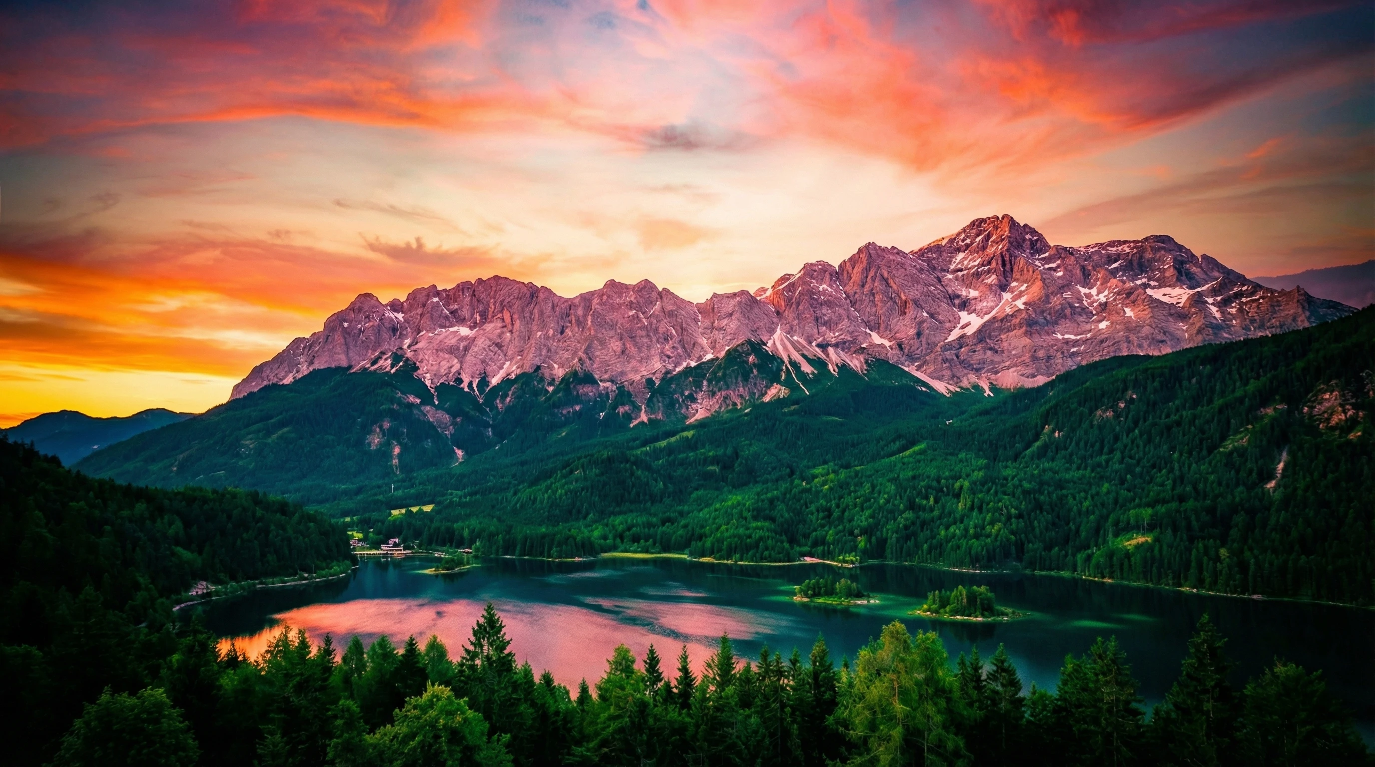
My Favorite Example: Mountain Sunrise
On my last trip to the mountains, I snapped a pre-dawn forest shot with super dark greens and a bright, colorful sky. I started in Lightroom with white balance, then used a linear gradient to darken the top third for that moody, early-morning feel. Pulling up the shadows brought out the tree trunks, and a bit of HSL tweaking made the pinks and oranges in the clouds match what I felt in person. A touch of clarity in the Details panel finished it off with a punchy, sharp look.
Advanced Tips: Making Colors Stand Out (But Still Look Real)
It’s really important to keep edits believable. I usually compare my final result to the basic RAW file to make sure it doesn’t look strange or over-edited. Using Lightroom presets can be tempting, but I prefer starting with a base look and then adjusting by hand; it keeps things unique and true to what I saw on location.
For those craving even more punch, don’t ignore selective color work. Using masks, you can target only the greens in a field or the blues in water for extra attention. If you want next-level vibrancy, experiment with color grading (found under the Color Grading panel) to add custom tints to the shadows, midtones, or highlights. This is a cool way to set a mood or match a certain style.
Gaining confidence with these tricks will help you find your style over time. Each edit is a chance to show off your take on the world.
Recommended Equipment for Landscape Editing
- Monitor calibration: Even basic calibrators help make sure your screen shows colors correctly. Your edits will look great at home and not appear strange on someone else’s phone or monitor.
- RAW-capable camera: Shooting RAW really gives maximum flexibility, especially for vibrant edits.
- Highquality SD cards: Extra reliability means you don’t lose those magical moments before editing even starts.
FAQ: Editing in Lightroom for Vibrant Landscapes
How do I stop skies from getting too bright?
After pulling Highlights down, try a linear gradient over the sky and use the Exposure and Dehaze sliders. This brings back detail and color without making it look fake.
What’s the difference between Vibrance and Saturation?
Vibrance boosts duller, lesssaturated colors and is more subtle, while Saturation increases intensity across all colors. I usually go easy on Saturation so I don’t overdo it.
Is it better to edit a RAW or JPEG landscape photo?
RAW files give way more information, so you can push colors and shadows further without ruining the image quality. JPEGs are convenient, but they’re tougher to edit for bold looks.
Final Thoughts: Why Lightroom Is Awesome for Vibrant Edits
Editing landscapes in Lightroom gives you power, flexibility, and a lot of room to experiment. Getting organized, understanding each slider, and handling local adjustments opens up tons of creative possibilities. It’s really satisfying to see a flat photo turn into a lively, colorful memory. Don’t be afraid to try new settings; sometimes the best images come from just exploring what Lightroom can do. Wrapping up, Lightroom remains the goto platform for taking your landscape photos to the next level.