Color grading vintage film simulation in Adobe Lightroom is a creative process that lets digital photos pick up some of that signature look you’d find in classic film stock. Even if you’ve never shot on film, you may have noticed how those older photos often have softer contrast, unique color tones, and a really nostalgic vibe that digital cameras just don’t replicate right out of the box. Getting that timeless look isn’t just about presets—it’s about understanding how color, grain, and tonal shifts work together. Here, I’ll walk you through my approach and offer some practical ways to pull off convincing vintage color grading in Lightroom.
Understanding the Vintage Film Aesthetic
Vintage film simulation is a style built on replicating what you’d see from oldschool films like Kodak Portra, Fujifilm Superia, or even the punchy look of slide films like Ektachrome. Unlike modern, crisp digital images, vintage film styles usually show muted contrast, creamy highlights, soft shadows, and a gentle shimmer of grain. Colors lean warm, and there’s often a subtle green, magenta, or yellow shift in shadows and highlights. The whole point is to create a natural, slightly imperfect mood that feels cozy and inviting. Photos don’t pop with perfection, they look lived-in and real.
Film simulation in Lightroom has become popular because so many people want their photos to stand out on social media or in print without too much effort. Instead of buying expensive cameras or scouring secondhand shops for old film bodies, you can use Lightroom’s powerful tools to get close to these classic looks. Knowing what makes vintage film pop visually helps you make choices that don’t just mimic presets but actually create something unique.
Getting Started: The Basics of Vintage Film Simulation in Lightroom
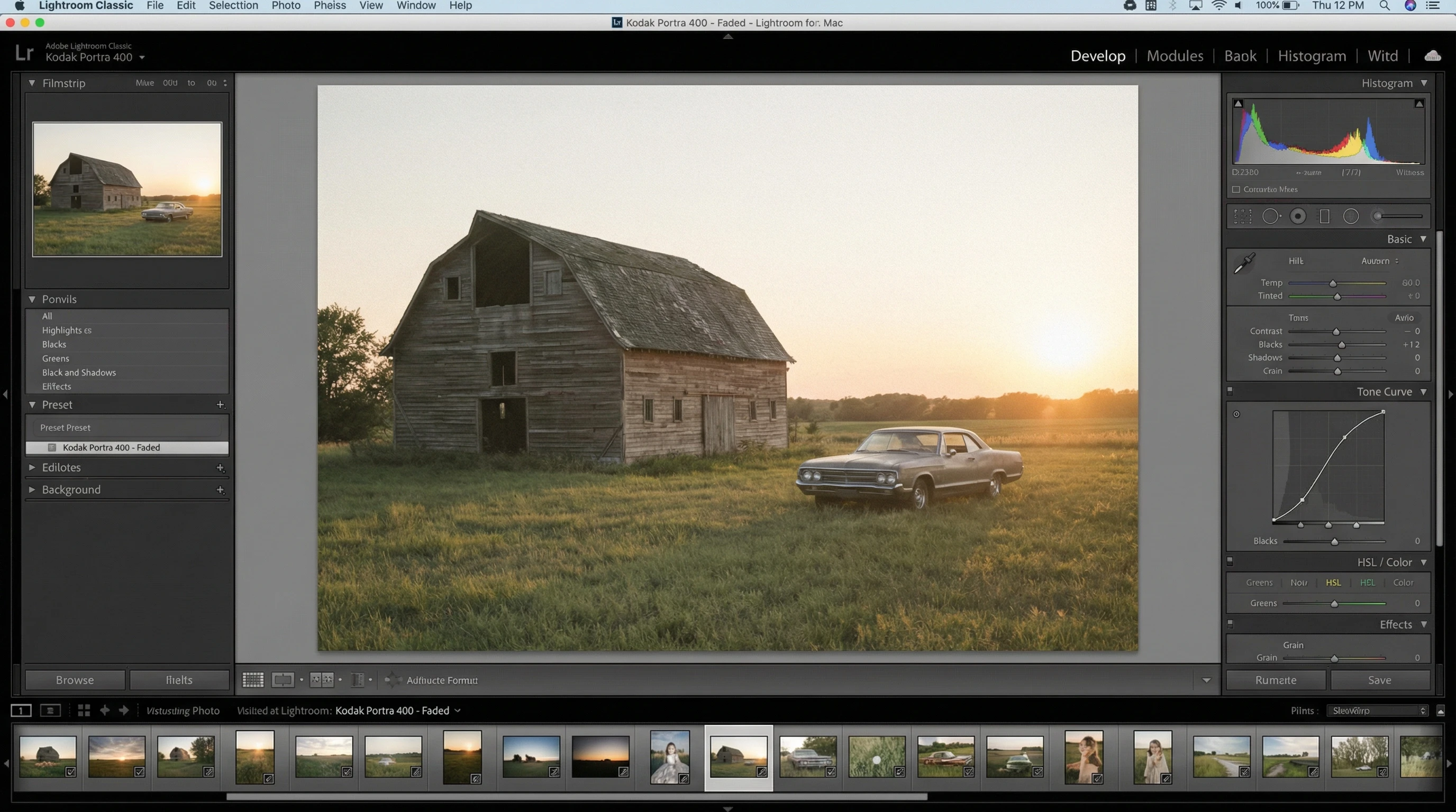
Lightroom’s Develop module is pretty much my playground for film simulation. Before getting into split toning or curve tweaks, I always try to start with the same few steps. Prepping your digital photo sets the stage for convincing vintage color grading.
- Exposure: Film often looks a bit underexposed or overexposed in parts. I usually nudge the exposure slider until I get an airy, bright base or drop it to build a moody vibe.
- White Balance: Vintage films aren’t perfectly balanced. Experiment with warming the temperature and bumping the tint towards magenta or green. This gives you a jump start on that classic color shift.
- Profile Selection: Lightroom’s built-in camera profiles can give you a jumpstart. Neutral or Portrait profiles soften contrast, making it easier to work the tones later.
Once you’ve prepped your image, you’re in a good spot to start playing with the actual film effect.
Core Tools for Authentic Film Simulation in Lightroom
The real magic with vintage film simulation happens when you master a few key tools. Each one lets you tweak aspects of the image in a way that feels handcrafted, not processed.
Tone Curve
The Tone Curve is my main tool for toying with that classic film fade. Dragging up the left edge of the curve lifts the blacks, which washes out deep shadows. Pulling down the right edge compresses the highlights. Tweaking the curve’s points will create that signature faded look without blowing out details.
Color Grading (Split Toning)
The color grading panel lets you push different hues into the shadows, midtones, and highlights. Vintage film often leans into teal greens in shadows and soft golds or pinks in highlights. I like to keep these color shifts subtle—just enough to notice, not so much that it’s cartoonish. Balance slider adjustments bring harmony between the colored tones.
Grain and Texture
Film is rarely perfect, so Lightroom’s Effects panel grain slider gets a lot of mileage. I add moderate grain for texture and dial in the size to taste. Too much can look fake, too little and you lose the retro feel. I also back off the sharpness in the Detail panel and will nudge in a touch of blur using the Clarity slider, which softens harsh digital edges.
Step-by-Step: Building a Vintage Film Look
- Import and Reset: Start by importing your photo and hitting the Reset button if you’ve made any edits. Clean slates are easier for film simulation.
- Cropping and Composition: Decide on a crop that fits the vintage vibe—a square or 4×5 aspect ratio usually feels more like classic prints.
- Global Adjustments: Adjust exposure and white balance as a foundation. Aim for a touch of over- or under-exposure, depending on the mood you want.
- Tone Curve: Set a gentle S-curve, then lift the shadows and drop the highlights using the curve’s endpoints. Create three subtle anchor points in between for natural tonality.
- Color Grading: Add a teal or green tone to shadows, a gold or magenta to highlights, and balance to taste. Keep saturation in the low-to-moderate range.
- HSL Panel Tweaks: Desaturate blues and greens a bit, shift red towards orange for skin tones, and boost yellow or light orange just a tad.
- Grain and Sharpness: Increase grain and decrease sharpening so your photo feels soft, textured, and not too crisp.
- Final Details: If the image feels too modern, drop clarity slightly or add a vignette for focus and extra mood.
Things to Keep in Mind When Grading for a Vintage Look
Film simulation in Lightroom isn’t just about copying a recipe. A few things make the experience better and your results more realistic:
- Reference Real Film Photos: I always keep a folder of scanned film images handy to compare tones and color shifts. There are tons of Flickr groups or Instagram accounts with great reference shots.
- Don’t Overdo It: Subtlety is really important. It’s easy to make colors too wild or fake-looking if you get carried away.
- Different Films, Different Looks: Each film stock is unique. Portra is muted and pastel; Ektachrome pops with blues. Have a point of reference in mind before you start adjusting sliders.
- Print vs. Digital: A grade that looks perfect on screen can sometimes look overdone in print. Always double-check your work before making prints for clients or hanging them up.
Troubleshooting Common Vintage Grading Mistakes
Overcooked colors, muddy shadows, and blocky grain are common pitfalls. When one of my edits looks unnatural, I pull up the history panel and backtrack until things start to look balanced again. Staying patient and taking breaks between rounds of editing helps keep my eyes fresh and my grades more convincing.
Advanced Tips to Nail That Analog Feel
Once you’ve nailed the basics, there’s more you can do to make photos shine with vintage film charm:
Soft Matte Effect: After the tone curve and color shifts, I’ll sometimes use a radial filter around the subject with reduced clarity, which builds a dreamy, oldlens effect. It’s pretty useful for portraits with a gentle glow.
Emulating Film Borders: If you want to go all out, you can add a white border to your final exported image using an external editor, since Lightroom doesn’t have a border tool. Square borders can help create that classic photo lab print vibe.
Light Leaks and Flares: For a creative touch, drop transparent light leak overlays or subtle flares using the Masking tool’s brush and warm tints. These mimic the happy accidents that used to happen on real film for extra character.
Frequently Asked Questions
Here are some super common questions I get from people wanting to try this kind of photo editing:
Question: Which Lightroom version is best for film simulation?
Answer: Lightroom Classic is my go-to, but you can get pretty similar results in Lightroom CC or even on the mobile app. Using Classic just means more finetuned controls for curves and localized edits.
Question: Are Lightroom presets worth using for vintage film looks?
Answer: Presets are pretty handy for getting started or building a look quickly, but you’ll probably want to tweak the results yourself. The cool part about doing it manually is you learn how and why things look the way they do.
Question: How do I make color grading less obvious?
Answer: Dialing back the intensity of color grading is just about subtle adjustments. Lower the saturation on color grading wheels, keep tone curve changes gentle, and always compare with the original as you go.
Practical Uses for Vintage Film Simulation
Vintage film grading isn’t just for Instagram throwbacks. Wedding photographers love it for romantic, timeless memories. Travel shooters get a sense of place and era with muted tones. Even brands use these grades for an approachable, retro vibe that stands out from slick modern edits. I’ve printed vintagegraded photos for home decor, zines, and client work, and they just have a warmth that draws people in.
- Wedding and Portrait Photography: Adds nostalgia and softens modern digital sharpness.
- Travel and Street Photography: Creates a sense of place and belonging to another time.
- Marketing and Branding: Gives products or campaigns a unique, down to earth appearance without heavy filters.
Experiment with these steps, and you’ll see how flexible Lightroom can be for all things vintage. The more you play, the more you’ll find yourself coming up with film styles that are entirely your own. Be willing to try new things and check out reference photos if you get stuck.
Getting that analog vibe isn’t about strict rules. It’s about experimenting, making mistakes, and learning what feels right for your style of work. Whether you’re a pro or just love the look, color grading vintage film simulation in Lightroom is a rewarding way to add character and mood to your photos.